Saturday, July 24, 2010

Week 10: Homeland Security


Here are the first two maps showing critical infrastructure and secure ingress and egress routes. I could not get the line of sight to work for the other two deliverables as of yet but will keep trying.

Thursday, July 8, 2010

Law Enforcement: Deliverables

Map 4 inlcuded several pitfalls during its production. One was deciding the layout itself and where to put the graph showing times and counts of crimes in D.C. The other problem was using the swipe tool. I tried to use it on the first density map and it did not work so I tried it again on this map and it worked. Nothing but the layer I was using was different.


Map 1 is the base map of Washington D.C. showing police stations, streets, and crimes. This map was not very difficult to produce therefore no pitfalls were endured.

The hardest part was deciding which major roads were going to be shown and how to label them properly.
I was unable to geocode the juvenile crimes CSV file no matter what I did therefore the grad extention was not completed. I noticed on the discussion board a few people had the same problem but must have fixed it because I could not.


Friday, June 25, 2010

Alachua County, FL

These two maps show the best census tracts in which to live in for the two retirees based on proximity to their grandchildren, community centers, Unitversity of Florida, and North Regional Medical Center in Gainesville, Florida.


These four maps show the proximity of the criteria placed on the selected tracts that the retirees were looking for in Alachua County, Fl.


Map 1 is an overall depiction of Alachua County, Florida showing various places near the grandchildren of the two retirees to choose a house close to the criteria they have chosen.


Tuesday, June 15, 2010

Week 5: Urban Planning and Environmental ImpactAssessment


The week 5 deliverables include three maps from the ESRI Module 5 exercises from Urban Planning and Envrionmental Impact. The first map shows the student occupancy rate of Pewter City based on parcels and housing types. I had no issues with the first deliverable.


The second deliverable displays an Economic Impact Assessment (EIA)of Pewter City based on traffic results. The only issue was with the forementioned step 4 fix in which I could never complete so I skipped to step 6 and continued on.


.


The third deliverable is an economic assessment map on a local scale using the calculation for local quotient. This map was almost entirely calculations using the field calculator function with the hardest part being which equation to use.


Wednesday, June 9, 2010

Part III of Deepwater Horizon Oil Spill

GIS can play a very important and unique role in disaster response and management. "GIS technology is used to collect, store, analyze, and share geospatial information needed by agencies to effectively support operations and restore disaster-affected communities."(ESRI.COM) Because of it's specialization in geospatial information, GIS can make issues such as which areas are the most impacted as well as how wide of an area is impacted by a natural hazard or disaster much easier to identify. By identifying areas of potential affect geographically it can make first responders jobs much more efficient and possibly easier especially when lives are at stake. In the event of the Deepwater Horizon oil spill GIS is playing a major role in staging areas for incident command posts, boom deployment, environmentally sensitive land, as well as help in forecasting potential landing areas of oil for on shore and offshore clean up. Not only can GIS be used to help disaster response agencies such as NOAA, EPA, USGS, etc... but volunteers such as Waterkeepers know where they are needed the most with the production of specialized maps of general areas. GIS is essentially the ultimate technology for prioritizing in emergency response during a major disaster such as we face with today's man made catastrophe.

Here is a link to my oil spill animation from April 29th to May 26th, 2010. You must have the latest version of Window's Media Player to view the avi. file. Oil Spill Animation

I found that I could not get the layers to open one by one in a new grouped layer so I just added them one by one as usual therefore opening the background along with the oil data. There is also the issue with a flutter everytime it opens in WMP for the first time. Cool option though and could be very useful in a Power Point presentation.

Deepwater Horizon Oil Spill


In this exercise I created two maps for the Garcon Point area of the Florida coast. The first showing environmentally sensitive land areas and wildlife which could be most impacted by the encroaching oil spill. As you can see much of the land around Garcon Point is important esturine or marshland that would be adversely impacted by the oil. Wildlife was not as abundant with the White-Tailed Deer being the only species to show up, although I do suspect there are many other species of wildlife that would be heavily impacted, especially marine life near and within the marsh. The second map shows boom operations and depicts the length of boom either in place or proposed around the Garcon Point area. The socioeconomic impact shown on this map was minimal but I am sure that is a matter of opinion.
This exercise was both interesting and challenging considering the direct impact this disaster is having on most of our lives at the moment. Once I got the projection problem worked out the rest was just a matter of designing the layouts. It was also the first time I had imported GIS into Google Earth which turns out to be very simple.

Tuesday, June 1, 2010

Week 3: Hurricanes

On October 19, 1995 Hurricane Wilma came ashore along the Southwestern coast of Florida bringing along with it Category 3 winds and a massive storm surge. In Key West, Florida most of the damage from Wilma was caused by the storm surge on the morning after the storm. Almost 90 percent of Key West was under at least 3 feet of water damaging near 60 percent of all homes and tens of thousands of vehicles on the island. Hurricane Wilma's storm surge came with waves as high as 8 feet and with the peak elevation of Key West being a little over 12 feet trouble ensued. The following map depicts the elevation and bathymetry of Key West.


As the above image suggests, the eastern end of the island is the most vulnerable to flooding in the event of a Hurricane. There is also the issue with the majority of the island being developed for either business, residential, or transportation reasons (70%). As the graphic below shows the developed areas of Key West were hit the hardest spiking the number of insurance claims made during the aftermath of Hurricane Wilma.


Infrastructure and health facilities on the island were also heavily damaged by the flooding on Novemeber 19, 2005. Two hospitals located on the western side of Key West were damaged during the storm surge event disrupting essentials like gas and electricity from generators, communications from down cell towers and utilities, and potable water and sewage disposal. Infrastructure such as highways, airports, and bridges were directly affected by the flood and could not be used, making the recovery response almost impossible during the first few hours and days after the storm. To make matters worse, Key West International Airport is located in one of the lowest lying areas on the island and has the potential to flood frequently in the event of a tropical system. This would make the major roads on the island first priority when considering which elements to restore. Interstates and Highways can be built above ground to help with the potential destruction from storm surge.
Both the hospitals and schools are clustered around the western portion of the island and should be less likely to stay flooded once a storm passes. Because the health care facilities on the island are limited they should be given first priority in terms of building restoration, then schools. Even though they are important to some people for mental and emotional support, churches can be given a low priority and restored once the infrastructure is back to normal.


In summary, the distribution of the flooded areas appears to be the heaviest on the eastern portion of the island where a lot of open water areas are located. The rest of the island is heavily developed and with the exception of a small area on the western end flooded as well. Considering that nearly 90% of the island flooded during only an 8 ft. storm surge, the long-term sustainability of the region is not good. Around 60% of homes flooded and thousands of vehicles were damaged assuring that all residents and business owners on the island should be required to own supplemental flood insurance. In the eventuality of another major hurricane hitting Key West the best plan is to evacuate all non-essential citizens and vehicles and stage relief and restoration efforts on the western end of the island to insure a quicker response to the most heavily flooded areas on the eastern end of Key West.

Project Response from the Author:
This project was extremely time consuming for me thought it seems that it should not have been. I constantly had problems with my outputs even though I organized my directories and environments exactly like the directions said. For some reason the elevation raster would not work during a math conversion then once I got that to work the land-cover raster would do the same thing. It was very frustrating and I had to find alternative ways to get to my outputs so if the numbers are different from what they should be this is why. The original elevation raster showed more than just Key West and when I converted it to feet it dropped the other data and just projected Key West which is what I went with for the calculations and final layouts for deliverables 2-5. All and all I learned a lot about why you would want to keep a process summary or notes and stay organized while creating a GIS project. It also helped me fine tune some little details about labeling and symbols that I had not been able to do in the previous class. Bring on the oil spill!

Wednesday, May 12, 2010

Maya Archaeologists use LiDAR

If anyone is interested, check this out! http://www.nytimes.com/2010/05/11/science/11maya.html?emc=eta1

Tuesday, April 27, 2010

Final Project

http://students.uwf.edu/bos1/Final_Project_Summary.pdf

http://students.uwf.edu/bos1/finalproject_presentation.pdf

Friday, April 9, 2010

Week 11: 3D Analyst


I just realized i had made the same mistake trying to save the file in 3D and not 2D. Better late than never. Other than that little problem the rest of the exercise happened to be pretty fun.

Wednesday, April 7, 2010

Week 11: Reclassify Data to a Common Scale


This is the final output for the vegetation rank map within the specified output. This exercise happened to be the quickest if not the least difficult one of the Module assigned. I chose not to fancy it up because I did not have all of the information necessary even though I could have made some assumptions to the north arrow and scale.

Week 11: Spatial Analyst Map 1


This was a very time consuming module all together and I originally had the model parameters correct and ran just fine but did not realize I had to show the model as my deliverable so when I reopened the mxd. file and tried to find the model, it was gone. On my second attempt to rerun the modelbuilder tool I kept getting an error for incorrect parameters. The original one had the drop shadows and worked just fine, but here is the snapshot requested.

Week 11: Customizing Labels


This exercise taught us how to customize our labels to make them more apropriate per feature. This was something I was very interested in from the beginning and just have not had time to experiment with during the semester so I enjoyed learning the different ways to label features in ArcMap.

Week 11: Managing Labels with Class

This exercise was very useful in teaching how to class and scale our labels, as well as symbols for labeling. I did not have much difficulty with the lab, but thought it was very useful and definitely will need for projects in the future.


Wednesday, March 24, 2010

Week 9: Vector Analysis II Map


Question 1: I decided to use the intersect overlay tool because it made the most sense to me for connecting the water and roads layers. I did not notice any difference between the union and intersect overlay tools.
Question 2: Used the erase tool to exclude areas of conservation areas that overlapped the potential campsites once again because it made the most sense because we were subtracting and not connecting portions of layers.
Question 3: There were a total of 748 features within the potential_sites layer. The area of the smallest feature was 748 and the area of the largest feature was 7,765,034 square meters.

Tuesday, March 16, 2010

Extra Credit Assignment


This assignment was actually kind of fun, because we got to use a lot of the things we have learned over the last few weeks and gave me a little more practice on things I really needed to refresh my memory on with out feeling under the gun. I would have added more features to the map but thought it might get a little crowded so I just added the cities and roads. Wow, I can't believe nine weeks have passed already! Brian

Tuesday, March 2, 2010

Week 7: Data Editing Map


Week 7 only presented minor problems with the snapping feature. I was finally able to tie the new road segment in with the already established roads feature by using the edge of the feature itself instead of using a vector which is what I was originally trying to do. Even though the ESRI labs might be considered boring and too instruction riddled, they help drive the point home with repetition and I found very helpful in completing the later lab assignment.

Friday, February 26, 2010

Week 6: Map 1


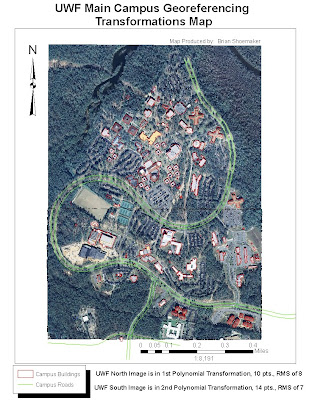
The Week 6 lab was much less frustrating for me than the previous one with much less trouble. The only thing which I had difficulty with was clipping a raster. I tried the ArcToolbox/Data Management Tool/Raster/Clip function with no luck. I originally added about 25 control points to the UWF South aerial and tried the 3rd Polynomial Transformation but thought it looked less accurate than with lesser control points and the 2nd Polynomial Transformation. My RMS was also much higher with more points for some reason so I left it in 2nd.

Monday, February 22, 2010

Week 5: Map 3


After realizing my mistake for the DEM file I have resubmitted my Lab 5 map 3 of Citrus County, FL. The Aerial (DOQQs) is of Crystal River, FL area and the 7.5' topographic quadrangle is of Holder, FL area. The DEM is of Homossassa, FL and obviously does not show much relief because of it's proximity to the coastline.

Sunday, February 21, 2010

Week 5: Map 2


Map 2 became extremely cumbersome with the land cover layer due to the large amount of data attached. I tried the strategic habitat conservation area layer but could not get that one to work

Week 5: Data Map 1


Map 1 of 3 shows the cities, public lands, major large hydrographic features and major roads. The hardest part was dealing with the eserver and finding a hydro-linear layer with only the major streams which I was unsuccessful at doing.

Thursday, February 4, 2010

Haiti Earthquake Map


This is the first satellite map of the Haiti earthquake produced by the European Space Agency (ESA) found at http://www.esa.int/. It shows the Port Au Prince area of Haiti just one day after the January 12th 7.0 magnitude earthquake and several aftershocks. This is a very revealing image of how devistating this natural disaster really was from a small scale view.

Week 4: Deliverable 1 (Map of Florida Counties)


This is a map of Florida Counties shown in three different projections; Albers, UTM, and State Plane. The difficulty was in how to display the data in the correct manor. I chose to go with a layout design with the four counties in comparison selected and labeled appropriately with the name of the county and area for each projection shown within each frame.

Sunday, January 31, 2010

Module 3: Deliverable 3 (Mexico Elevations)


The Mexico elevations raster map was intended to portray the elevation of the country in a stretched symbology scheme. The black and white color ramp seemed to work best with this kind of map because of the hill shading option which tends to show the mountain relief better.

Module 3: Deliverable 2 (Central Mexico)


This map was a little more difficult than the first one. I had a tough time getting the world populations layer to be labeled in annotation. The advanced labeling option is somewhat confusing. The inset was confusing at first but became straight forward after completed.

Saturday, January 30, 2010

Module 3: Deliverables


This is the population density map produced for week 3 lab assignment: GIS and Cartography. I found the difficulty for this map in creating the layout and getting it to look the way I wanted. A lot of things have changed since ArcView 3.0.

Tuesday, January 19, 2010

Module 2: Deliverable 1 (Countries by Population)


The toughest part of the assignment was finding out which scale text to use for some reason. Overall, after you have the layers already designed, using ArcMap is not that hard, yet!