Friday, February 26, 2010

Week 6: Map 1


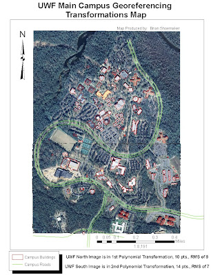
The Week 6 lab was much less frustrating for me than the previous one with much less trouble. The only thing which I had difficulty with was clipping a raster. I tried the ArcToolbox/Data Management Tool/Raster/Clip function with no luck. I originally added about 25 control points to the UWF South aerial and tried the 3rd Polynomial Transformation but thought it looked less accurate than with lesser control points and the 2nd Polynomial Transformation. My RMS was also much higher with more points for some reason so I left it in 2nd.

Monday, February 22, 2010

Week 5: Map 3


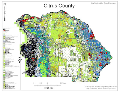
After realizing my mistake for the DEM file I have resubmitted my Lab 5 map 3 of Citrus County, FL. The Aerial (DOQQs) is of Crystal River, FL area and the 7.5' topographic quadrangle is of Holder, FL area. The DEM is of Homossassa, FL and obviously does not show much relief because of it's proximity to the coastline.

Sunday, February 21, 2010

Week 5: Map 2


Map 2 became extremely cumbersome with the land cover layer due to the large amount of data attached. I tried the strategic habitat conservation area layer but could not get that one to work

Week 5: Data Map 1


Map 1 of 3 shows the cities, public lands, major large hydrographic features and major roads. The hardest part was dealing with the eserver and finding a hydro-linear layer with only the major streams which I was unsuccessful at doing.

Thursday, February 4, 2010

Haiti Earthquake Map


This is the first satellite map of the Haiti earthquake produced by the European Space Agency (ESA) found at http://www.esa.int/. It shows the Port Au Prince area of Haiti just one day after the January 12th 7.0 magnitude earthquake and several aftershocks. This is a very revealing image of how devistating this natural disaster really was from a small scale view.

Week 4: Deliverable 1 (Map of Florida Counties)


This is a map of Florida Counties shown in three different projections; Albers, UTM, and State Plane. The difficulty was in how to display the data in the correct manor. I chose to go with a layout design with the four counties in comparison selected and labeled appropriately with the name of the county and area for each projection shown within each frame.